Everybody knows
the menu.
We built
the website.

mcdindia.com is the official website of McDonald’s India (North & East). It holds the menu, the restaurants, McDelivery, McCafé and the birthday parties. SIDDATWORK® built it.
mcdindia.com is the front door for McDonald’s across the north and east of India. It has four plain jobs. Show the menu. Find the nearest restaurant. Start a McDelivery order. Keep up with whatever is new this month.
Whose site it is
It belongs to Connaught Plaza Restaurants, the company that owns and operates McDonald’s restaurants in the north and east of India. Its restaurants run from Amritsar to Guwahati.
What we did
We built mcdindia.com. It runs on WordPress, on a custom theme we wrote for it.
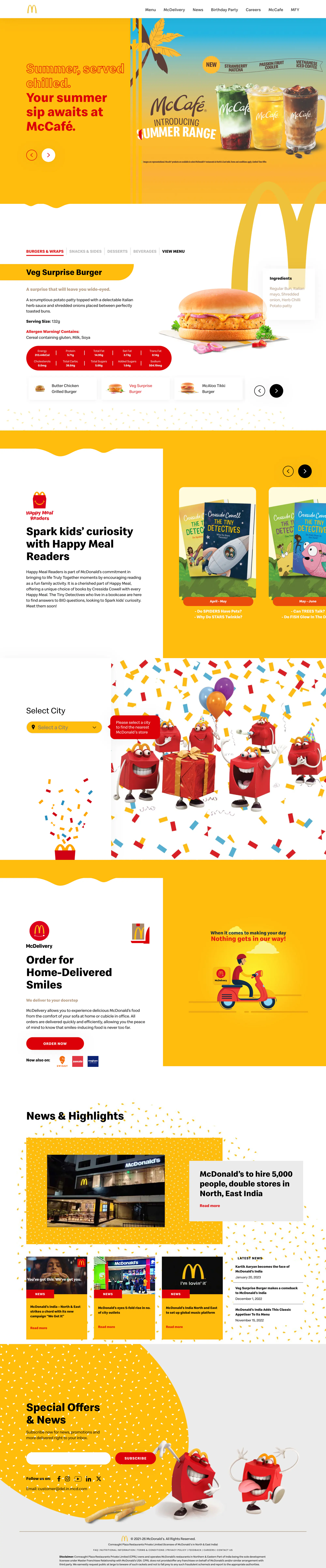
The whole home page, top to bottom.
Keep scrolling. The page moves inside the frame.It rolls by on its own here. Every part is named below.Scroll inside the frame to read it. Every part is named here.
The first screen
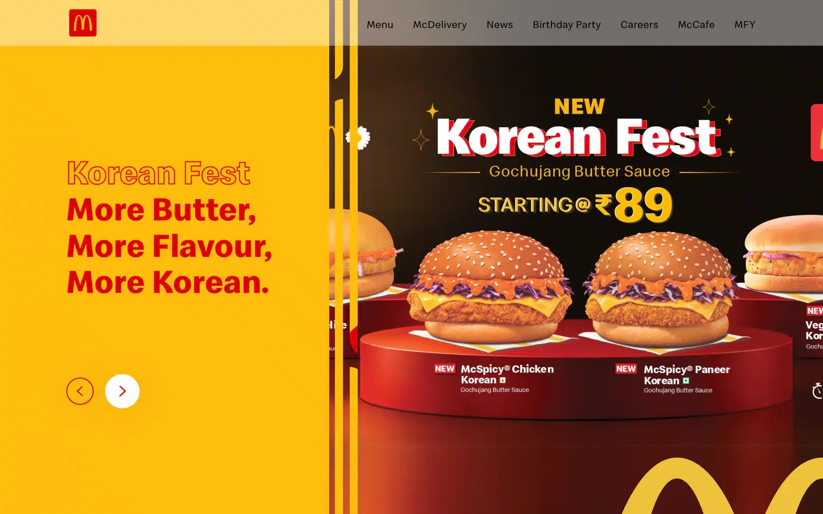
A split. Red headline on yellow, this month’s campaign beside it, and two arrows to flip through the rest.
Menu
Every burger, side, dessert and drink, each with its ingredients, allergens and nutrition.
Happy Meal
The books that come in the box this season, laid out month by month.
Restaurants
Pick a city. See which counters are open.
McDelivery
One red button to order, and the delivery apps that carry it too.
News & Highlights
Press coverage and announcements, with one story given the big card.
Special Offers & News
A sign-up box, the social links, and two Happy Meal boxes having a very good day.
The first screen changes with the calendar.
The layout never has to.
The home page opens on eight slides today, from iced coffee to a Korean burger to a notice about scams. Each one is only a headline and a picture, so nothing about the design has to move when the campaign does.
Headline and picture slide across together. The seam hides behind a row of yellow bars.
Watch it happen, then keep going through seven of today’s slides.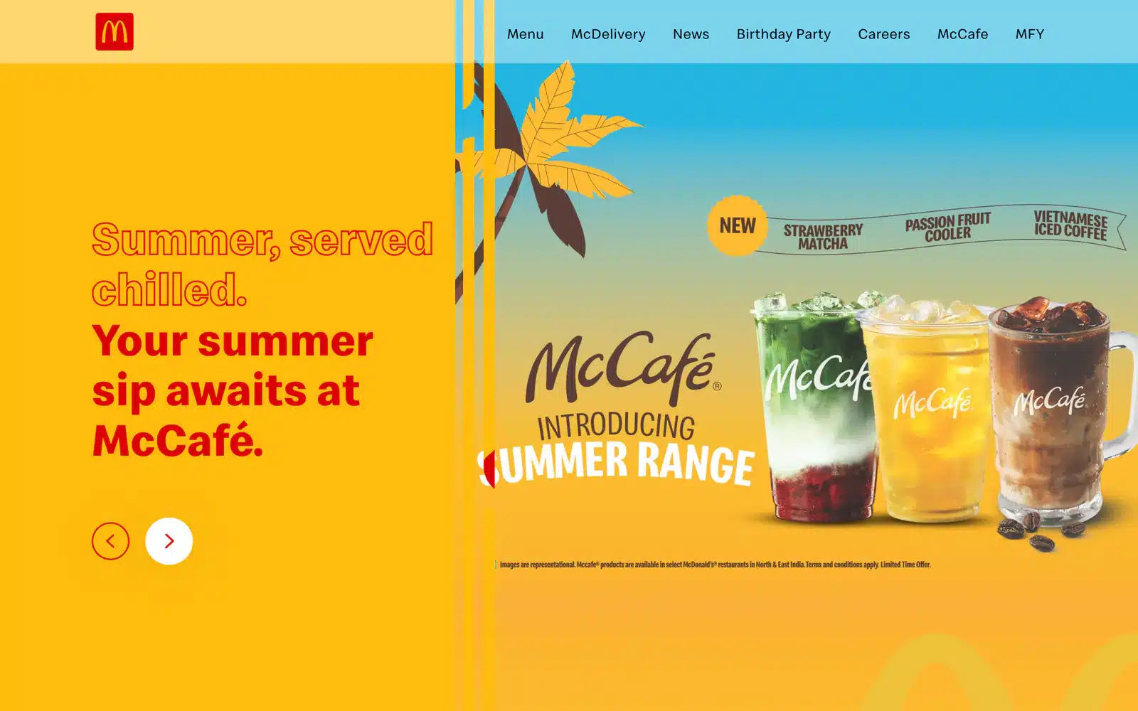
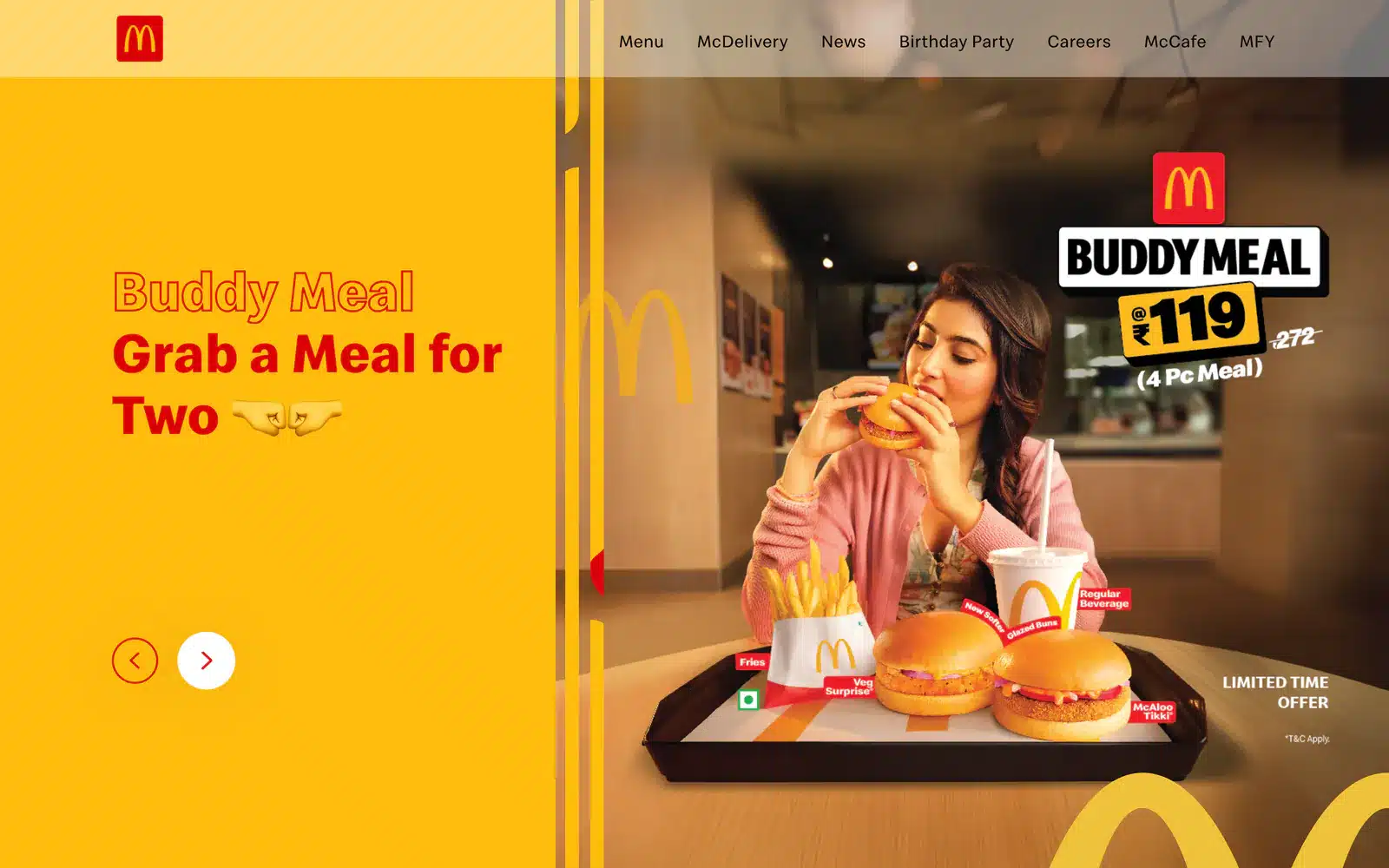
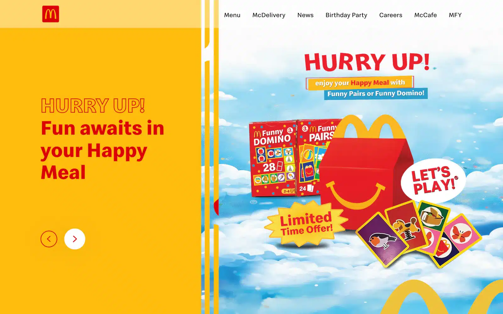
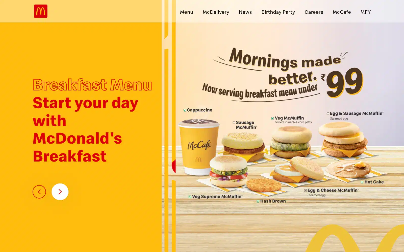
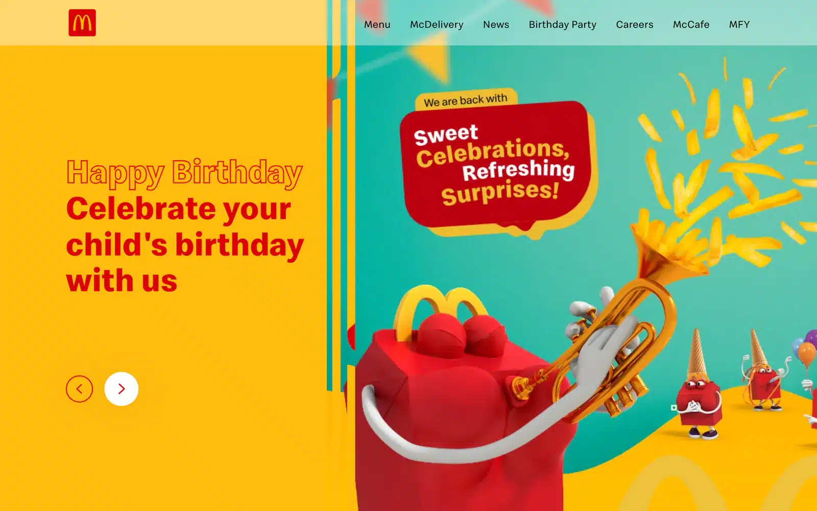
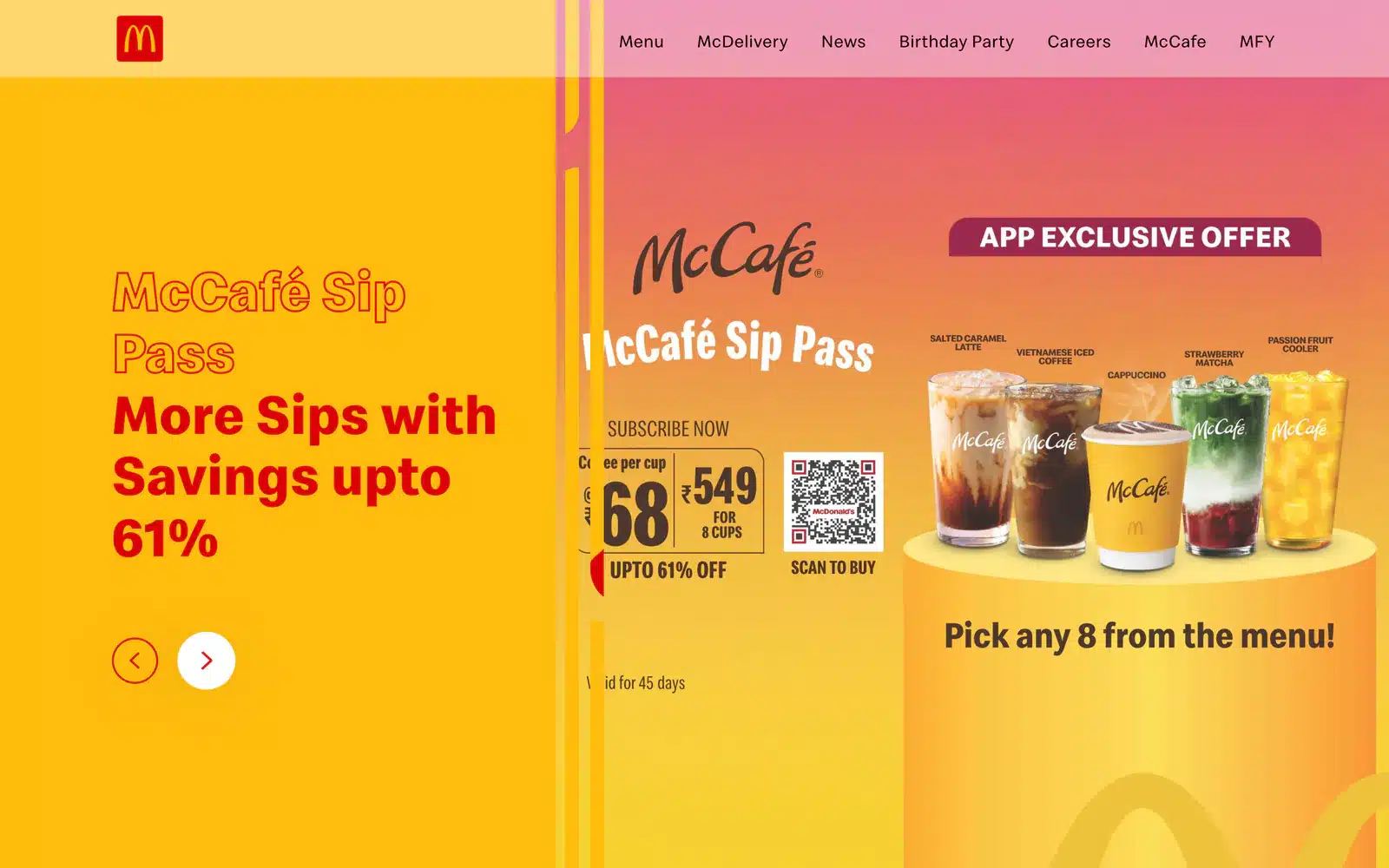
Only the first picture loads with the page. The other seven wait until someone reaches for the slider.
A small kindness to a slow connection.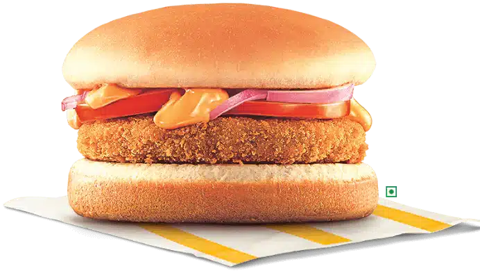
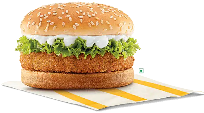
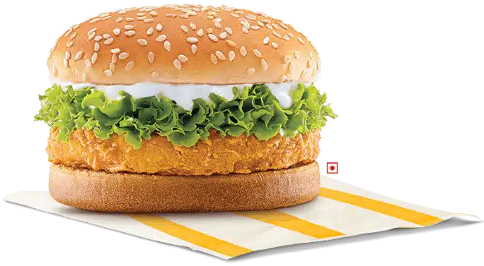
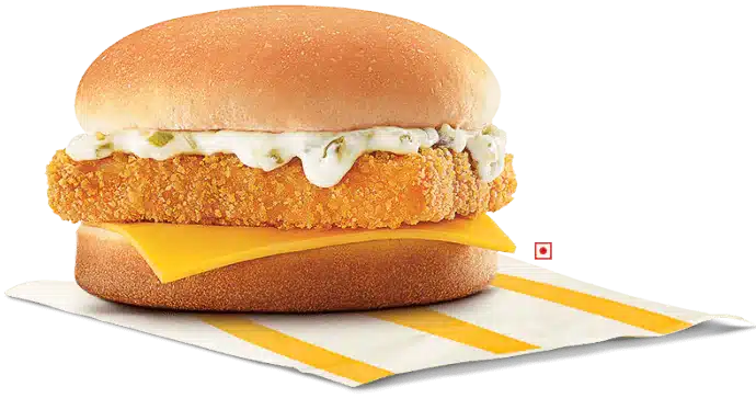
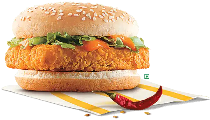
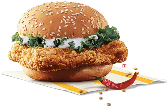
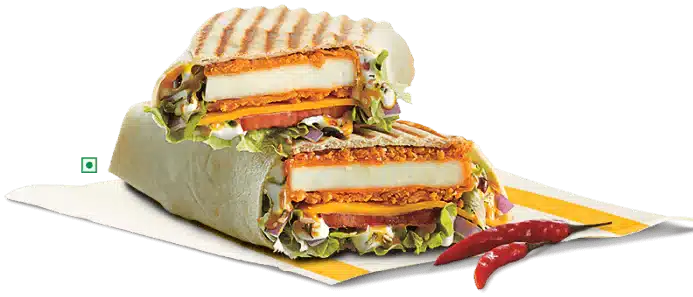
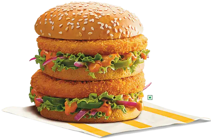
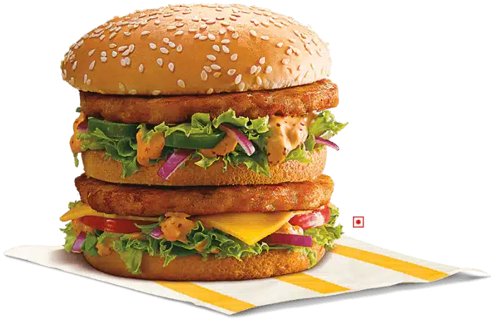
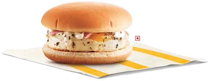
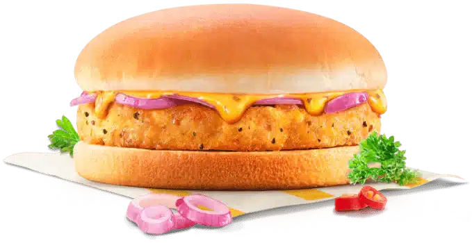
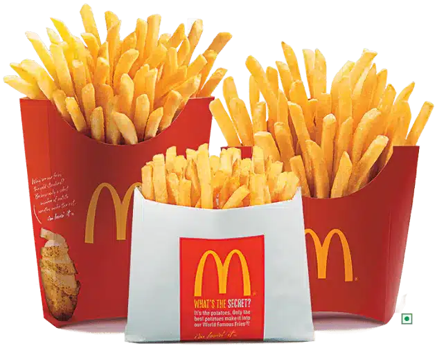
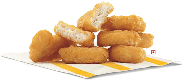
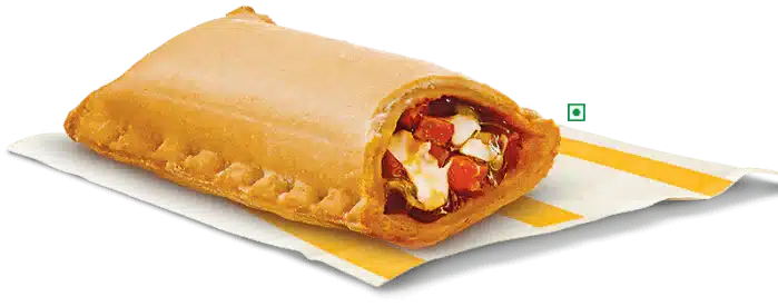
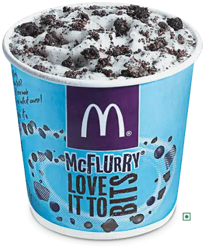

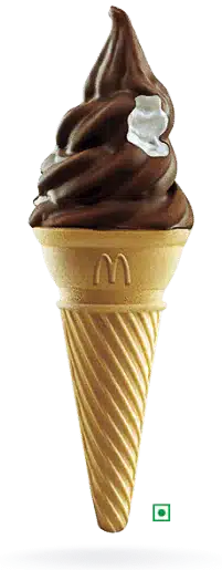
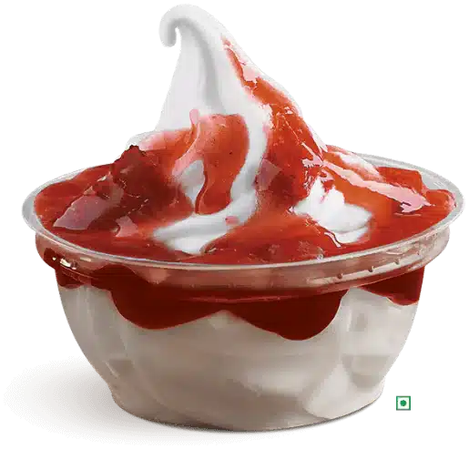
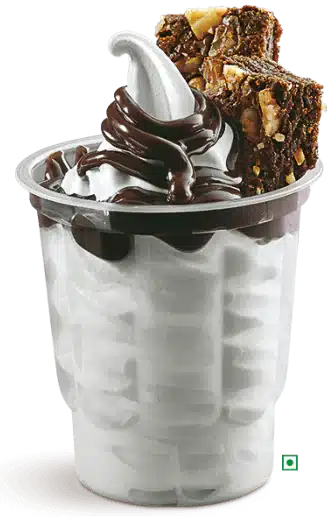
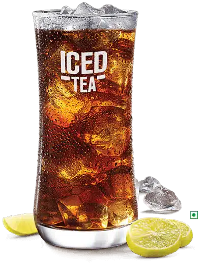

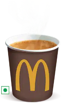
One screen holds the whole menu.
A menu this size usually turns into a maze of category pages. Here it is a single section of the home page, and nothing in it makes you wait for a page to load.
Four tabs and a tray
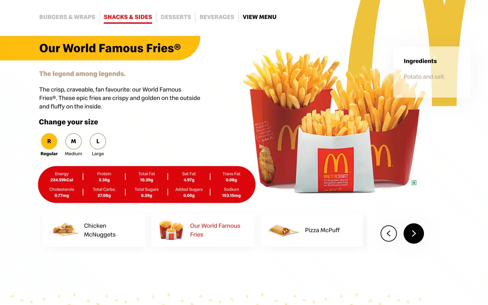
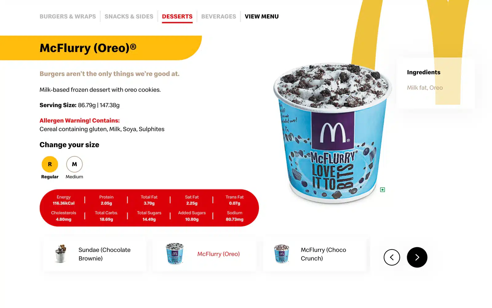
The tabs swap the category. Three small cards and two arrows move you through it, one item at a time, and the name, the story and the photograph change in place.
The label is part of the design
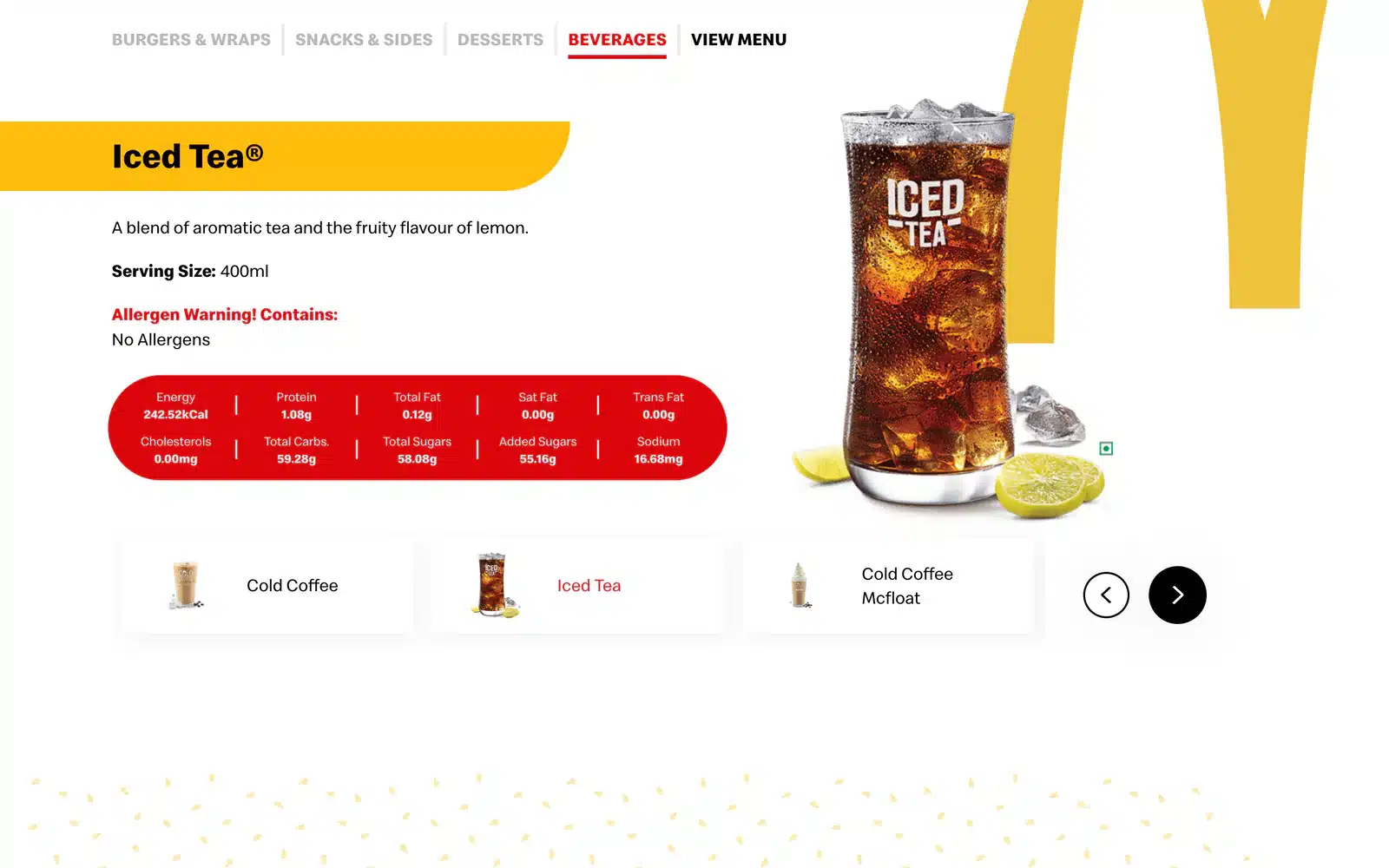
Serving size, allergens in red, ingredients on their own card, and ten nutrition figures in a red bar under every item.
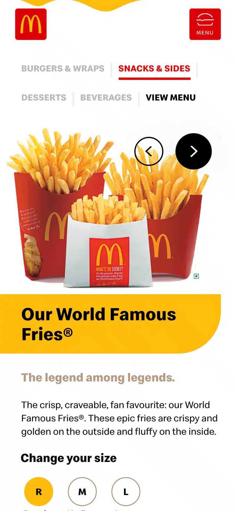
Fries come in three sizes. Tap R, M or L and the figures change to match. The tabs below switch the picture.
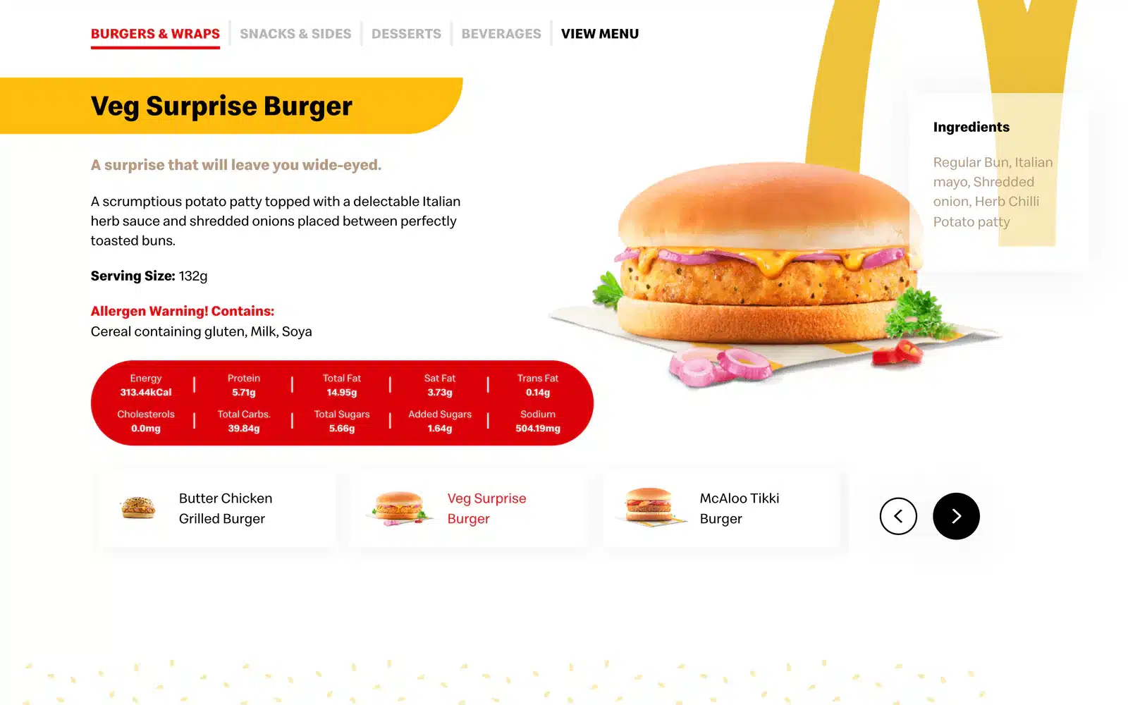
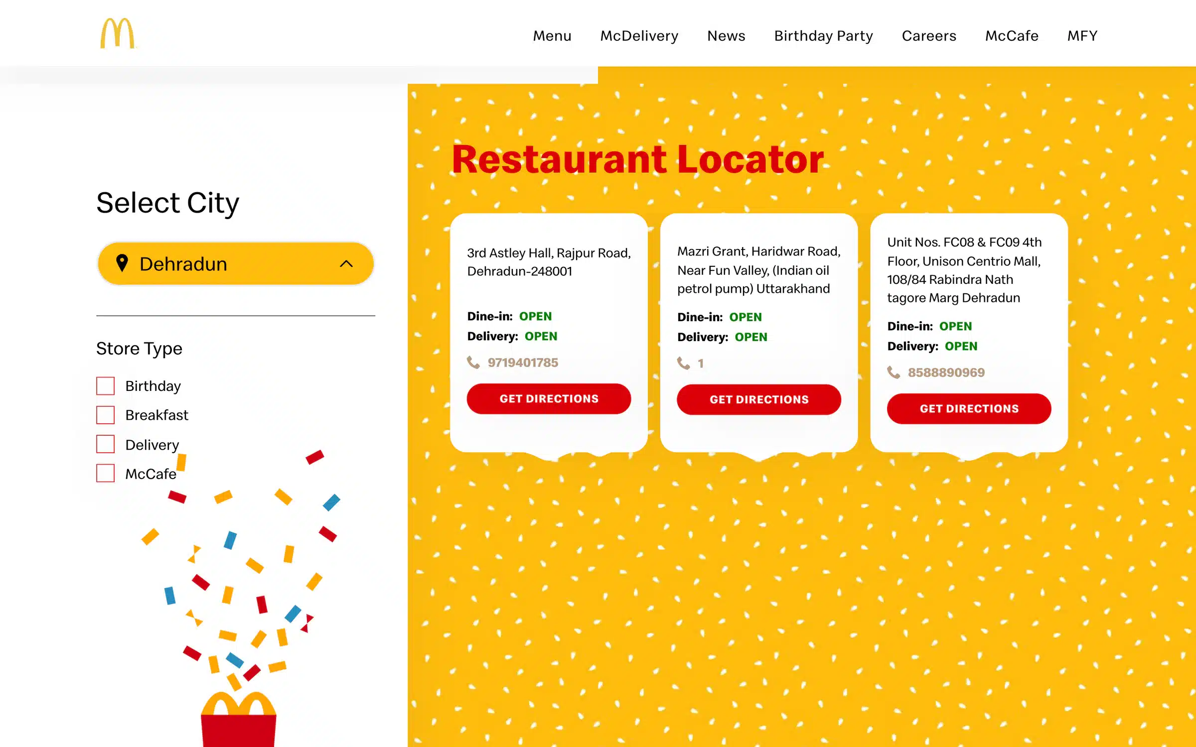
Find a McDonald’s without opening a map.
Choose a city and the cards fill in beside it: the address, whether dine-in and delivery are open right now, a phone number and a button for directions. Four checkboxes narrow the list to restaurants that host birthdays, serve breakfast, deliver or have a McCafé.
For this picture we set it to Dehradun. It is where our studio is.
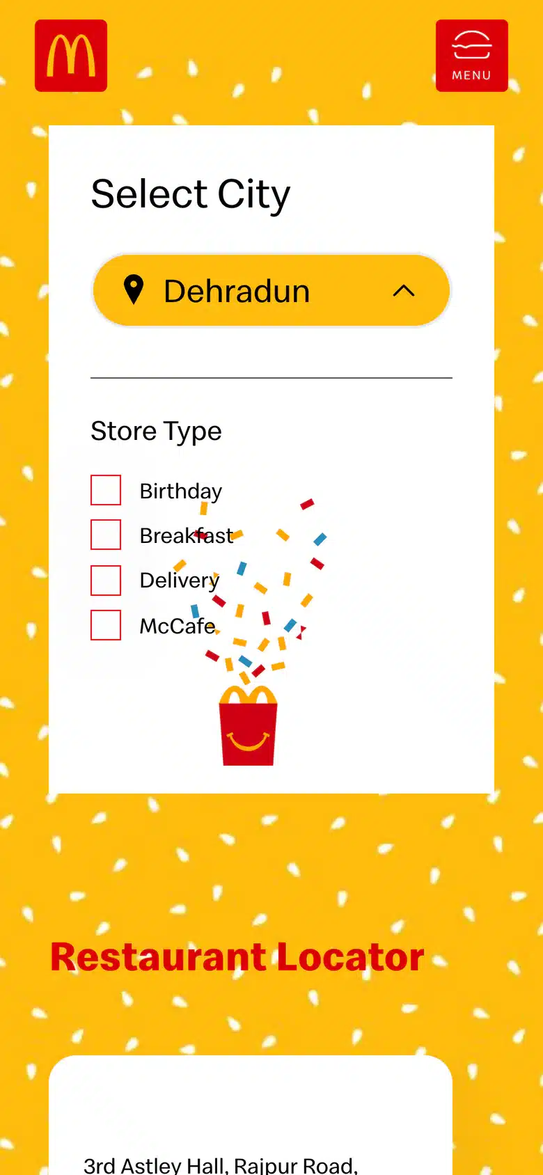
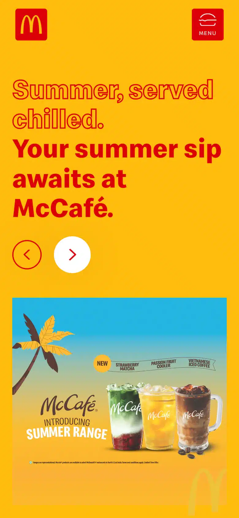
The same site, held in one hand.
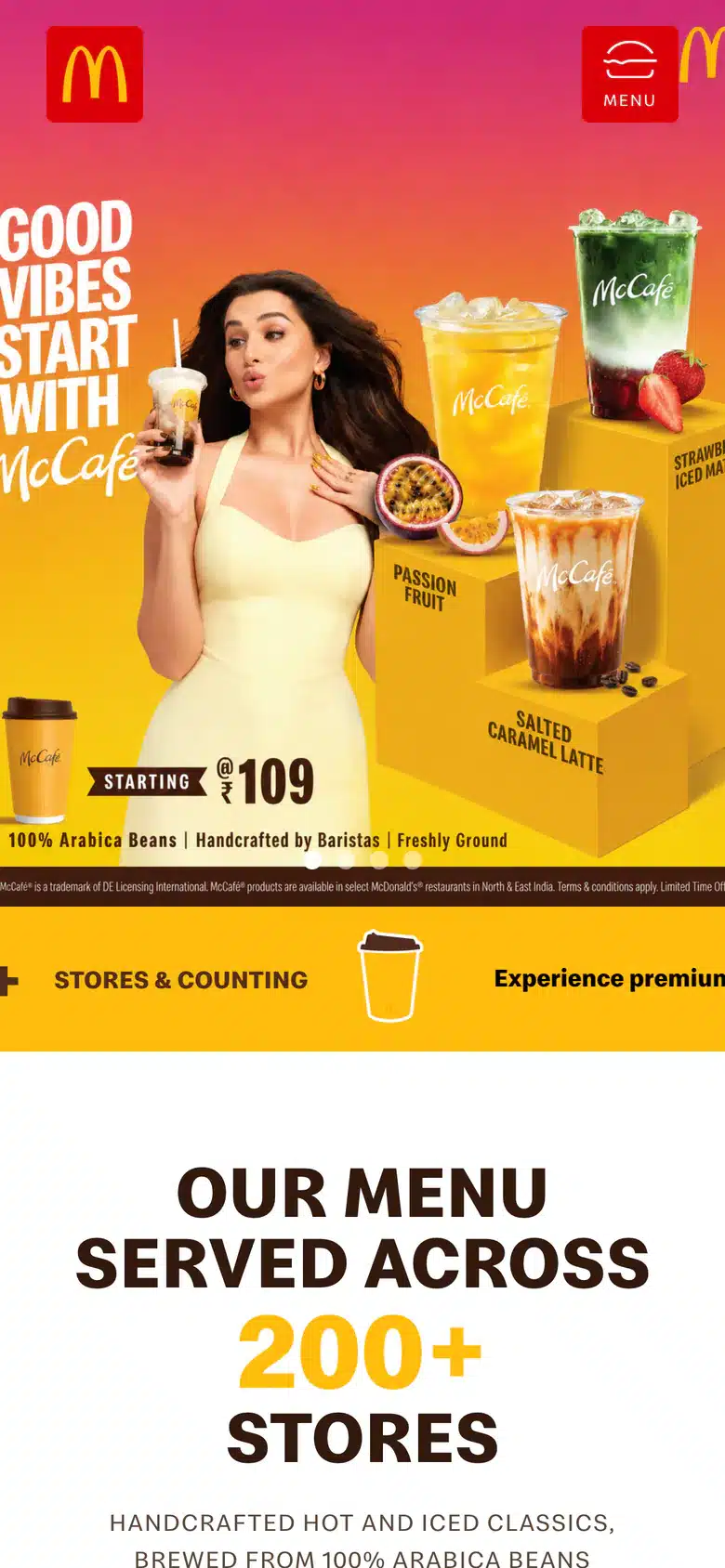
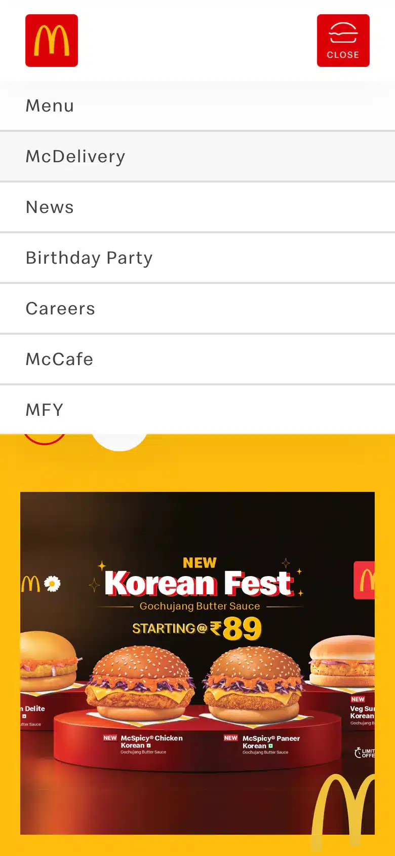
On a phone the split first screen stacks, headline over picture. The menu keeps its four tabs and puts the photograph first. The navigation folds into one red button in the corner.

And the rooms behind the lobby.
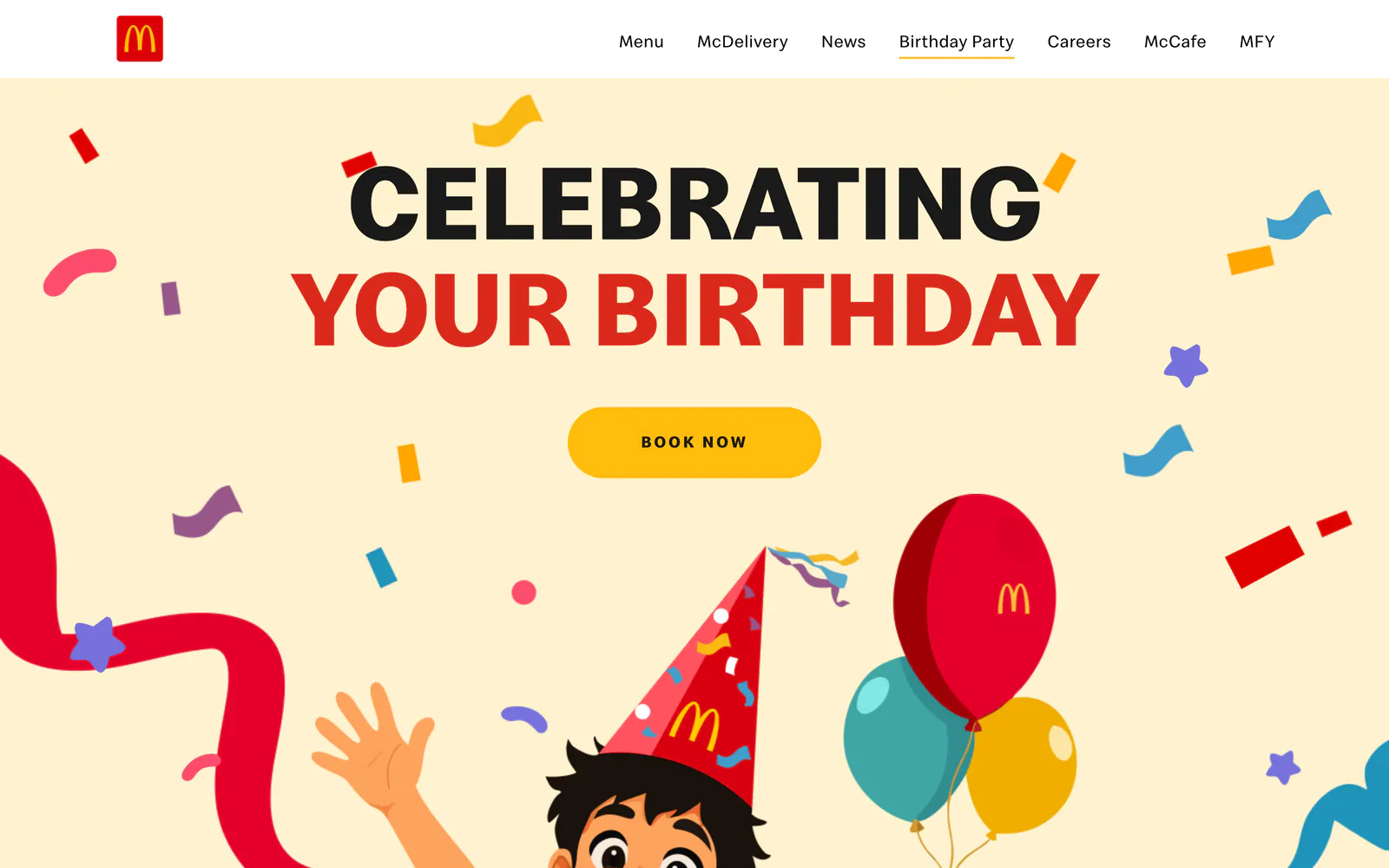
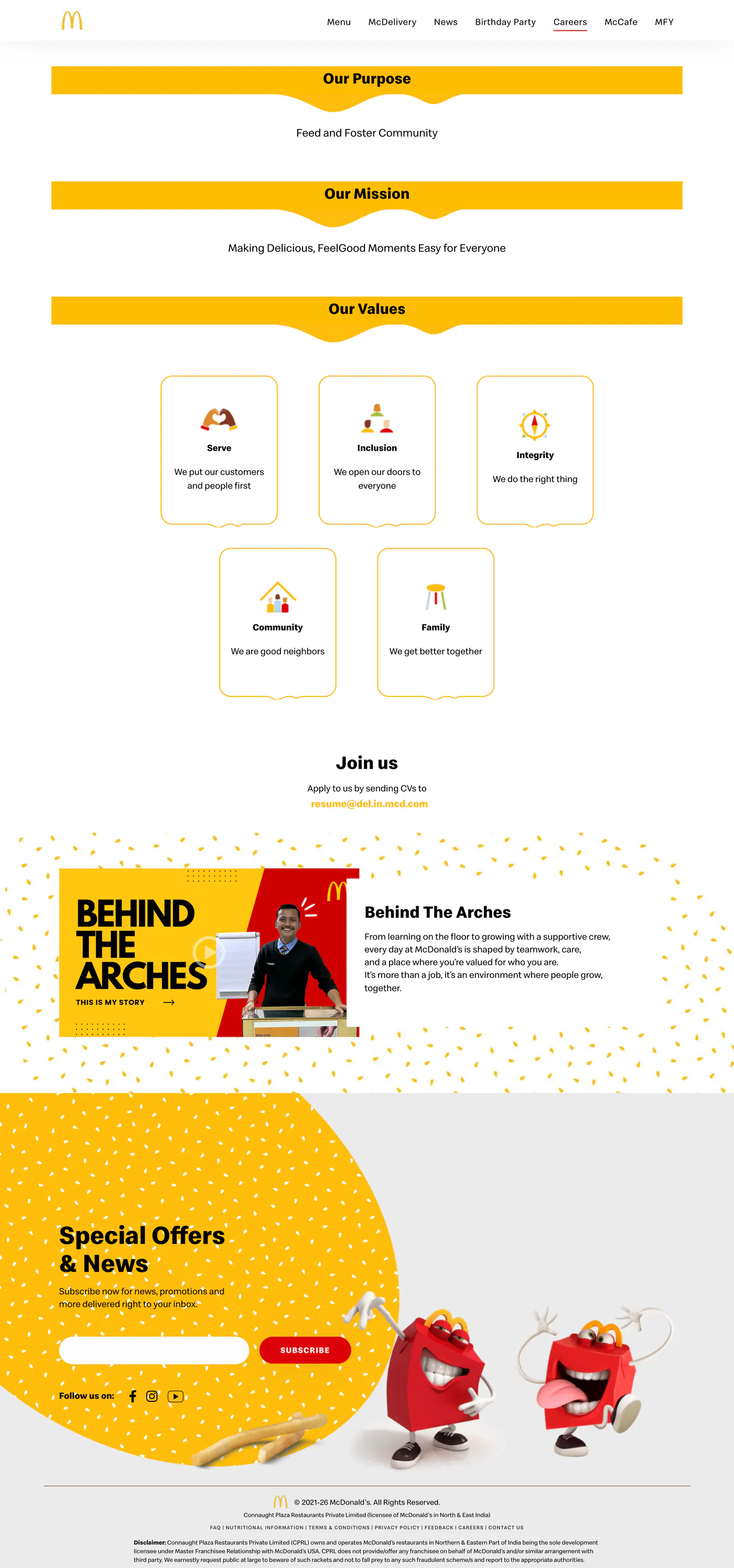
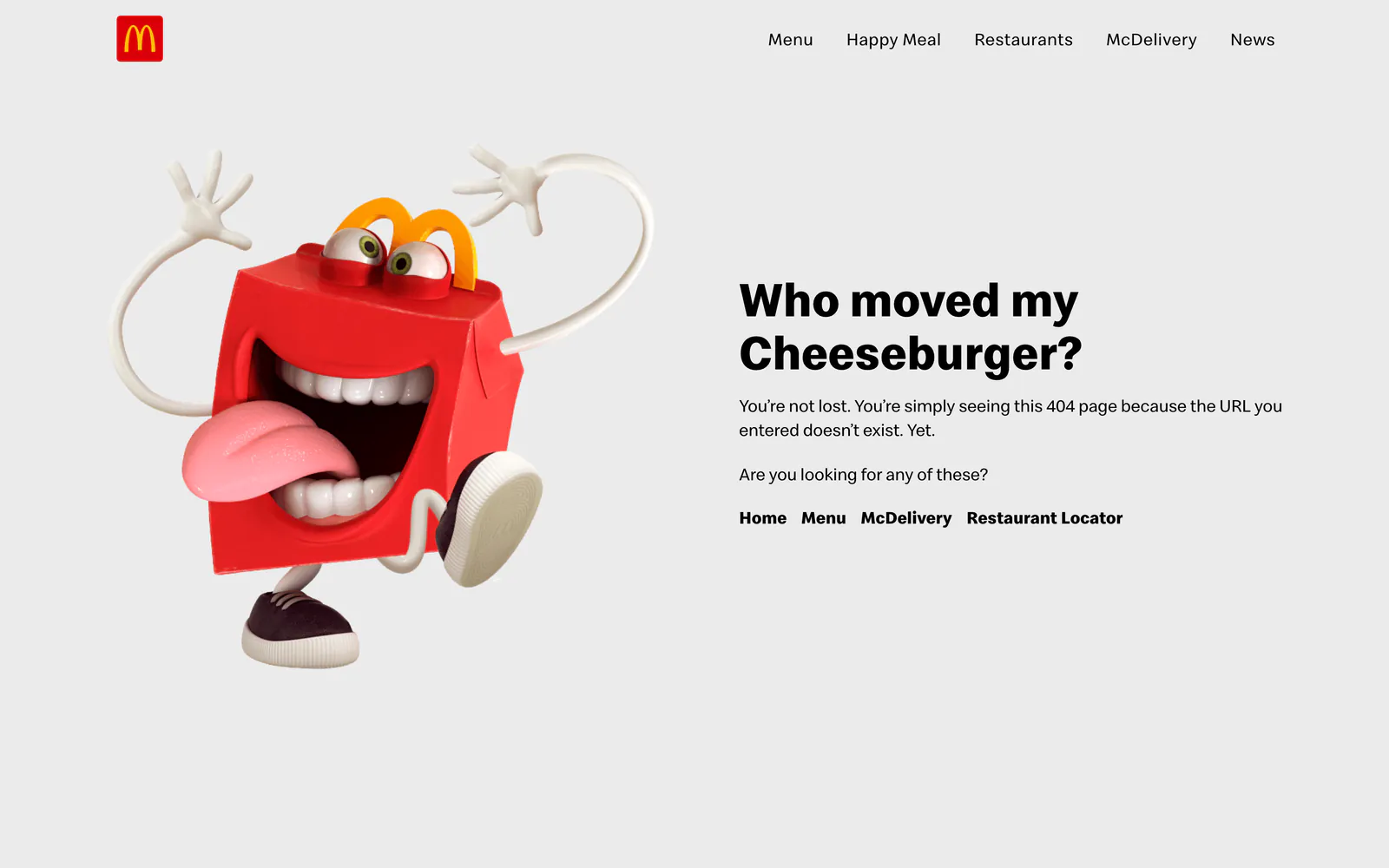
McCafé has its own long page. Birthdays have a booking page. Careers sets out the purpose, the mission and the values. Even the wrong turn got a Happy Meal box.