Drama school, delivered to the living room.
Ekalavya is the Drama School Mumbai’s on-demand e-learning programme: acting and theatre courses taught by the school’s own faculty, taken from home, in more than one language, at a cost most people can afford. We designed the brand and built the first website from scratch.
- Deliverables
- Brand identity. UI and UX design. Custom WordPress development. Speed and performance optimisation.
Theatre training has always meant being in the room. Ekalavya wanted to take the rigour of the Drama School Mumbai, the same faculty, the same exercises, and make it something you could do from your own home, in your own time, in your own language. The site had to feel like a school, not a video library.
Position the brand first
Ekalavya was new. The website’s main job was to tell people who it was and what it stood for, and to do that through how it looked and moved as much as through what it said. Do more with less. Intrigue before you inform.
From identity to launch, together
We started with the mark and the colours, carried them into the pages, then built the whole thing on WordPress. It was close, collaborative work, done on tight timelines.
A stage, a programme, a course.
Curtain up on a lesson.
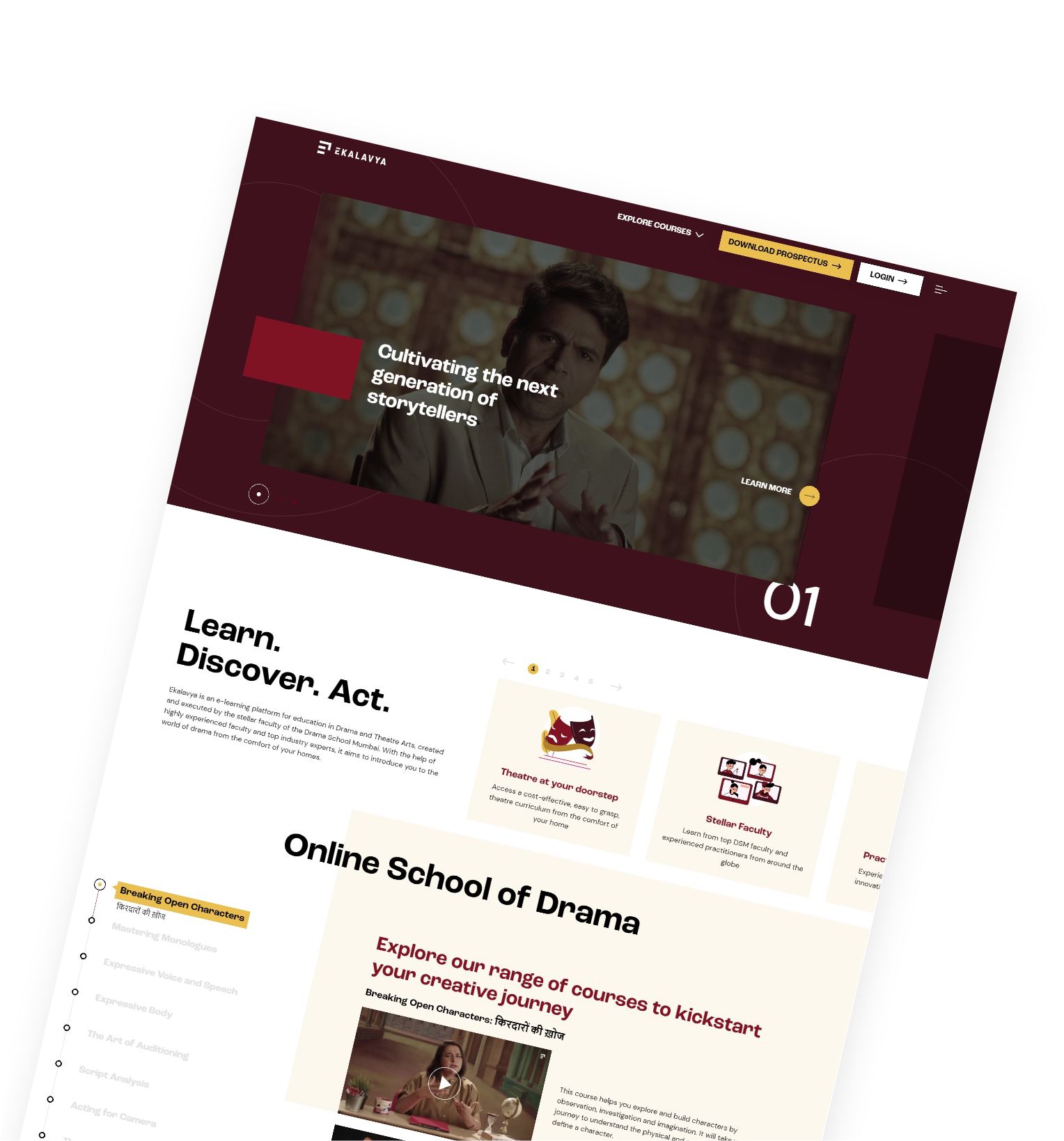
The home page opens like a stage: a deep maroon frame around a still from a class, one line about cultivating the next generation of storytellers, and a numbered slide so you know there is more. Explore courses, download the prospectus, log in. Nothing else competes.
Learn. Discover. Act.
Below the fold the site explains the school, then lays out what a course asks of you: eight to twelve hours, engaging tasks, self-paced modules, a closing performance, a self-evaluation. Each course card carries its name in English and Hindi, the facilitator, the hours and the price.
Preview, commit, start.
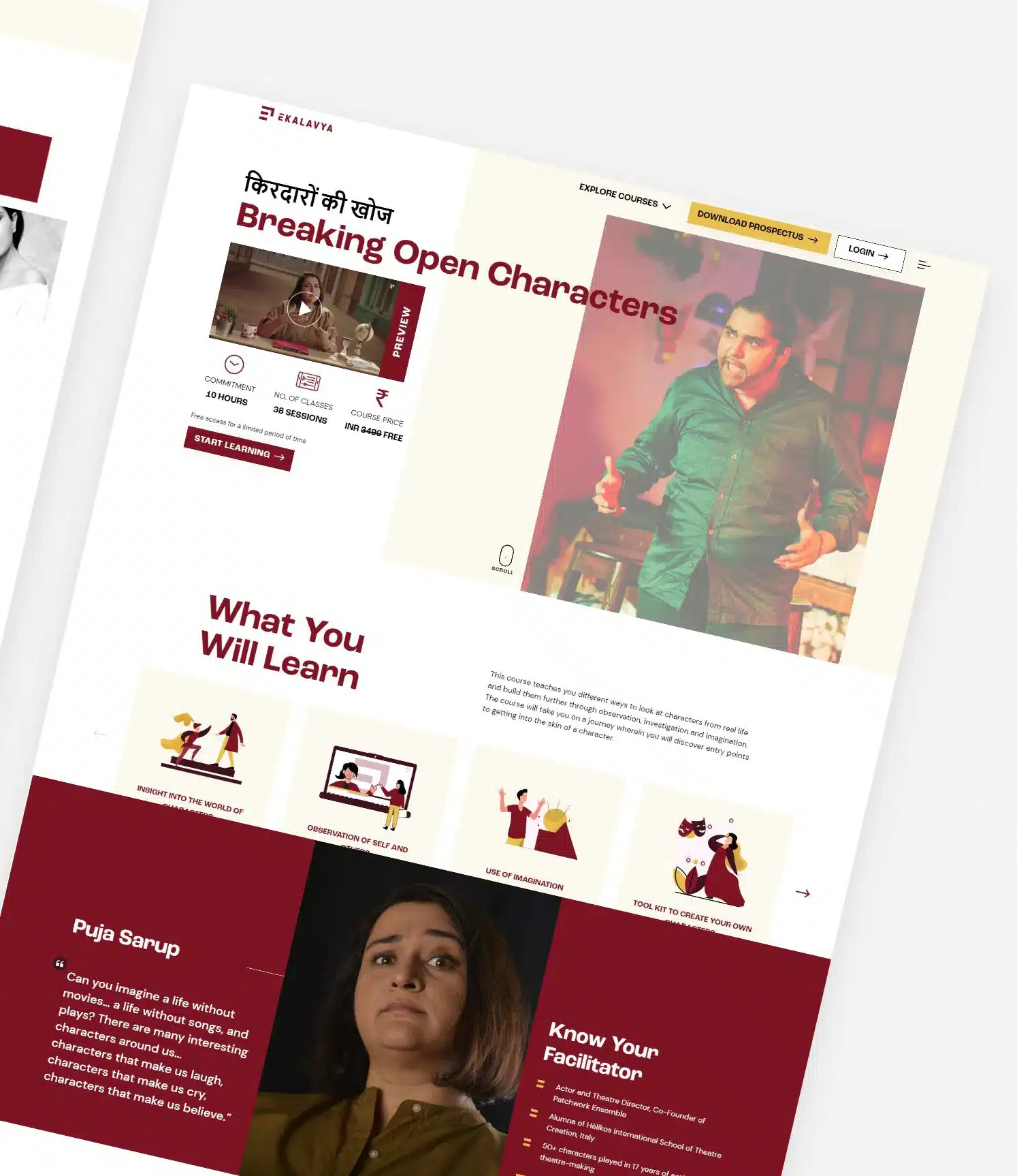
Every course page leads with a preview video and the three numbers people want before they buy: commitment, number of classes, price. Then what you will learn, drawn as four illustrated cards, and a Know Your Facilitator block in the brand’s maroon with the teacher’s own words.
Faces, numbers, voices.
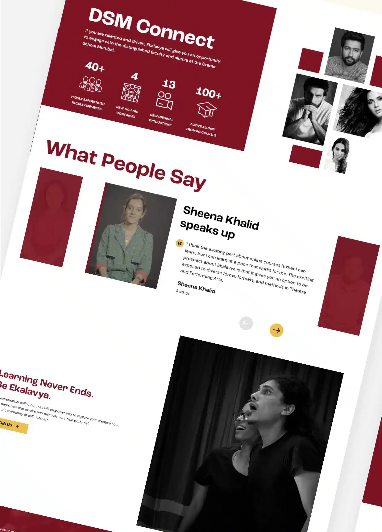
DSM Connect introduces the Drama School Mumbai through its faculty, laid out in a brick grid that echoes the logo, with the school’s own figures beside them. What People Say gives learners the floor, and the page signs off with the line the brand still uses: Learning never ends. Be Ekalavya.

An E made of building blocks.
The mark is a letter E built from bars, with one bar lifting away on the right. It stands for the building blocks of learning and growth, with an arrow on the diagonal that nods to the legend while rising upwards and beyond itself.
The name comes from the archer in the Mahabharata who taught himself. The brand reads it as self-driven learning, rigour and commitment to craft, which is exactly what an online drama school asks of its students.
#801323The curtain. Headings, buttons and the mark.
#3E111DThe dark of the house before the lights go up.
#E9BE4ECalls to action and the spotlight.
#B1832DMustard’s quieter sibling for hover and detail.
#FEF4F9Soft section backgrounds.
#FCF8EDPaper behind the course cards.
Headings · Roc Grotesk Bold

Wide, confident and a little theatrical. Big enough to carry a one-line headline over a video still.
Hindi · Arya

Every course has a Hindi name beside the English one, so the Devanagari needed its own display face with the same weight on the page.
Body · DM Sans
One body face for both scripts, so the reading rhythm never changes.
Course descriptions, facilitator bios and prices all sit in DM Sans. Plain, open and easy on a phone, which is where most learners would find the school.
Sixteen little scenes.
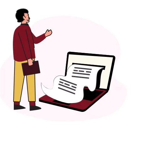
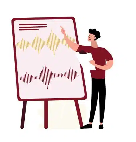
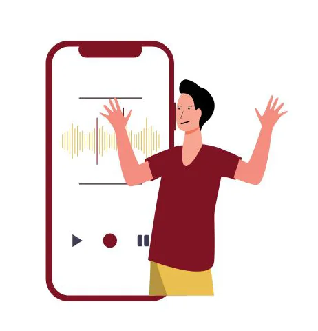
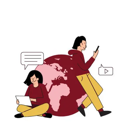
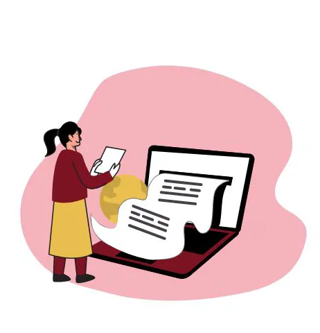
A set of illustrations in the brand’s maroon and mustard: rehearsals, monologues, a voice lesson on a phone, a certificate at the end. They sit on course pages under What You Will Learn, so a dry list of outcomes reads like a programme.
Drawn for the course pages.
Scroll to see the set →

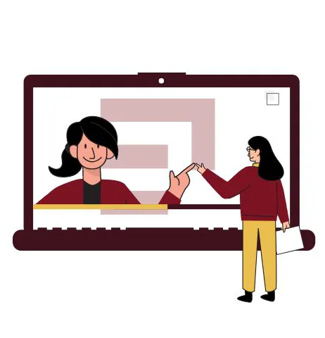
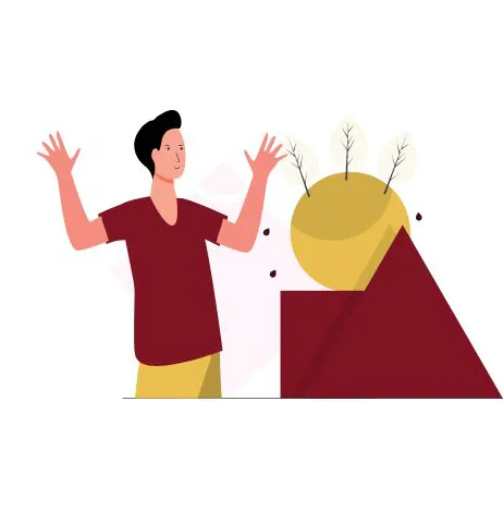

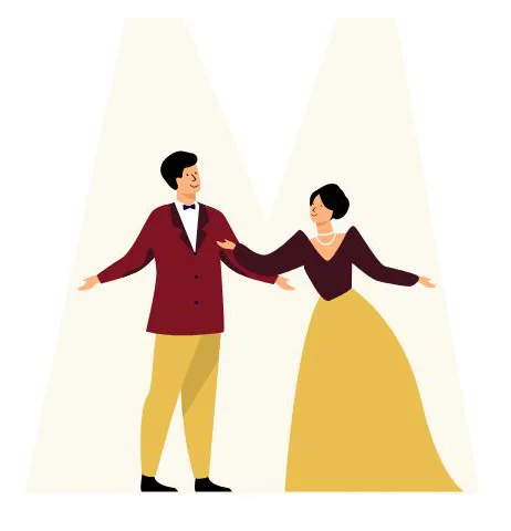
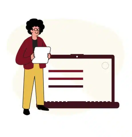





Bars, bricks and chevrons.
Pull the mark apart and you get a bar. Lay the bars down and you get a brick pattern. Tilt two of them and you get the chevron. That one family of shapes became the site’s background texture, its faculty grid and its section corners, so every page is quietly built from the logo.

Icons with one line weight.
A small set of line icons for the programme promises and the school’s figures: a stage, a certificate, a checklist, a handshake. Drawn in the brand maroon at one stroke weight so they sit quietly on the dark tiles.
“We wanted a website design that inspires, and the ideas that SIDDATWORK came up with were truly exceptional. Starting from brand identity to website development, work with SIDDATWORK was very collaborative and seamless, despite the tight timelines.”
Backstage, where it has to work.
A school that sells courses needs a site that is quick, stays up, and hands every enquiry to the right person. Here is what we built behind the curtain.
- 01WordPress, built custom
No off-the-shelf theme. Templates made for Ekalavya, editable by its own team.
- 02Responsive, with custom animations
The numbered slides, the brick grids and the reveals were built by hand and tuned for phones first.
- 03Zoho for leads
Prospectus downloads and enquiries flow into Zoho, so lead collection and follow-up happen in one place.
- 04Speed and performance optimisation
Video-heavy pages, tuned so the first fold is on screen before anyone gives up.
- 05Care from WPKnights
Our WordPress care team looked after core and plugin updates, security and speed.
Learning never ends.
Ekalavya is still teaching at ekalavya.art, and the brand we drew is still on the door: the maroon, the mustard and the E.